Longtail Studios - PopTeams
Project Overview
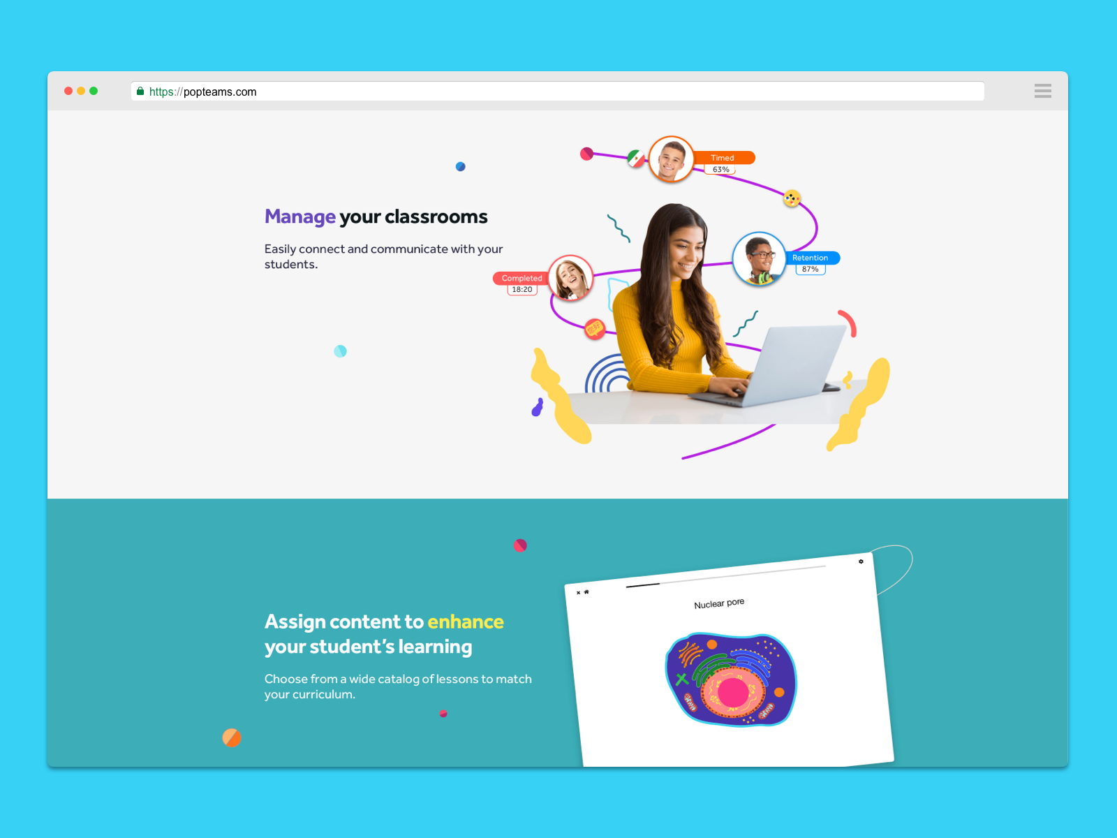
The branding entails geometric shapes from the word “pop” to highlight PopTeams subject personalization and professionalism.
My Responsibility
Brand Designer
Identity
THE SYMBOL
Overlapping symmetrical letter P designed to find harmony between color and balance.
Color Elements
Website


